Having trouble identifying the email delivery status and the reasons behind failed email delivery. If so, then we’ve got you covered! Welcome to our latest update on Post SMTP!

Today, we are excited to announce the release of PostSMTP v2.5.8, which significantly improves the email log screen with enhanced visibility and a simplified interface, which makes managing email logs easier than ever.
Keep reading as we are going to show you how the new log screen solves the problems of the previous one and how you can update your current PostSMTP version to v2.5.8 and try it out for yourself.
Let’s dive right in!
Problem #1: Difficulty in Identifying Failed and Successful Emails
In the past, many of you faced challenges when trying to monitor and troubleshoot email deliveries. The previous version of PostSMTP showed a red and green dot for failed and successfully delivered emails, respectively.
The previous email log screen interface had no clear visibility, which made it difficult to understand the status of your emails at a glance.
Solution #1: Introducing Failed/Success Labels to Improve Visibility
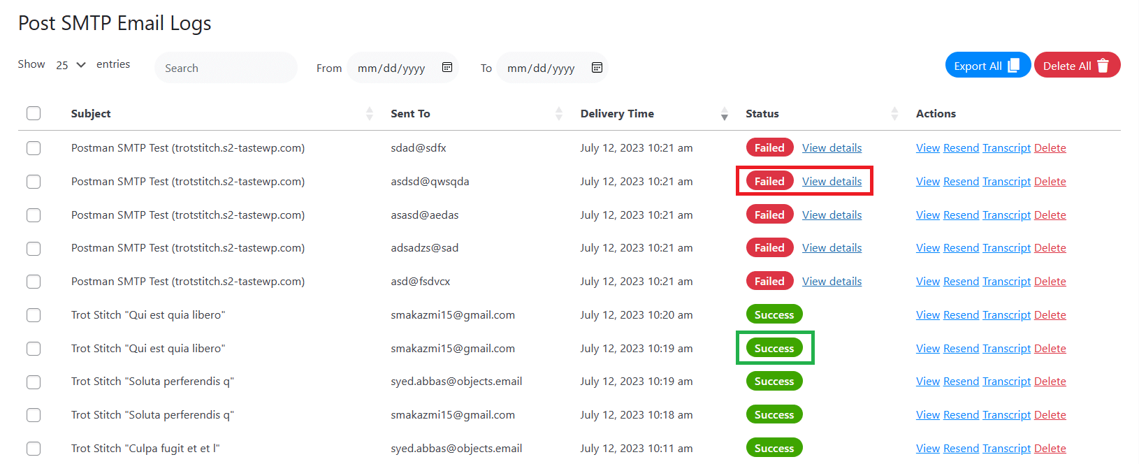
To make it easier for you to see the status of each email, we’ve introduced Failed/Success labels to the new log screen. These labels are color-coded (red for failed, green for success) and clearly indicate whether an email was delivered or not.

With these labels, you can quickly scan the log screen and spot any failed emails without having to look for error icons or messages. You can also sort the log entries by status (failed or success) to filter out the ones you want to focus on.
This feature saves you time and hassle when checking your email delivery performance. It also helps you avoid missing any critical issues or errors that might affect your email reputation or customer satisfaction.
Problem #2: Cluttered and Limited Error Message Visibility
Another limitation of the previous log screen design was that it displayed the error message for each failed email in a separate column. Thus, it made the log screen cluttered and hard to read.
The error message column also added complexity to the log section’s user experience (UX). You had to scroll forward to read the entire error message for more details about why an email failed.
Unfortunately, this was not very intuitive or user-friendly. It was small, and it sometimes overlapped with other elements on the screen.
Solution #2: Simplified Error Message Display via Hover and Popup
To address these challenges, we have implemented two essential improvements. First, we’ve simplified the interface and enhanced the user experience by removing the error column.
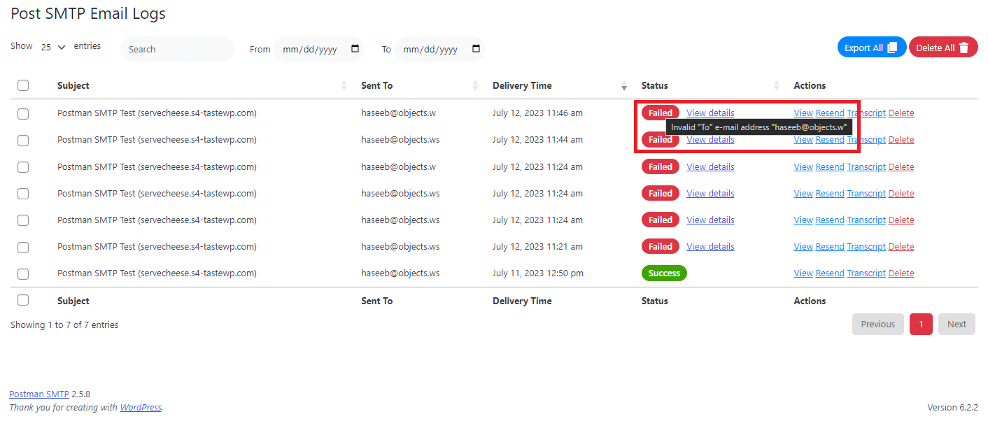
Secondly, we have introduced an error message display on hover and in popups. Now, when you hover over an email status, a concise error message will appear, providing you with instant information about the delivery issue.

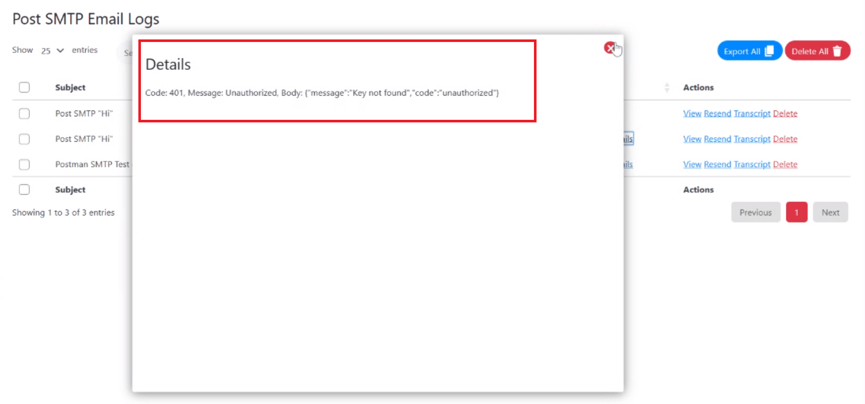
Additionally, we have included error message popups, which you can access by clicking on the “view details” link next to the status column.

This feature ensures that your email log screen remains uncluttered while providing you with essential details when needed.
To Sum It Up
With the release of PostSMTP v2.5.8, we have significantly improved the email log screen. These improvements will make your email delivery tracking easier, faster, and more efficient.
If you want to experience the benefits of the new log screen for yourself, you can update to PostSMTP v2.5.8 today. Just go to your WordPress dashboard, navigate to Plugins > Installed Plugins, and click on Update Now under PostSMTP.
We are committed to continuously improving our product to meet your needs and provide you with the best email delivery solution available.
Also, we’d love to hear your feedback and suggestions on how we can make PostSMTP even better for you. Please provide your feedback by contacting us contact us through our support channel.
Thank you for using PostSMTP and trusting us with your email delivery needs. We always look forward to serving you with more updates and features in the future.


